 Salah wardi
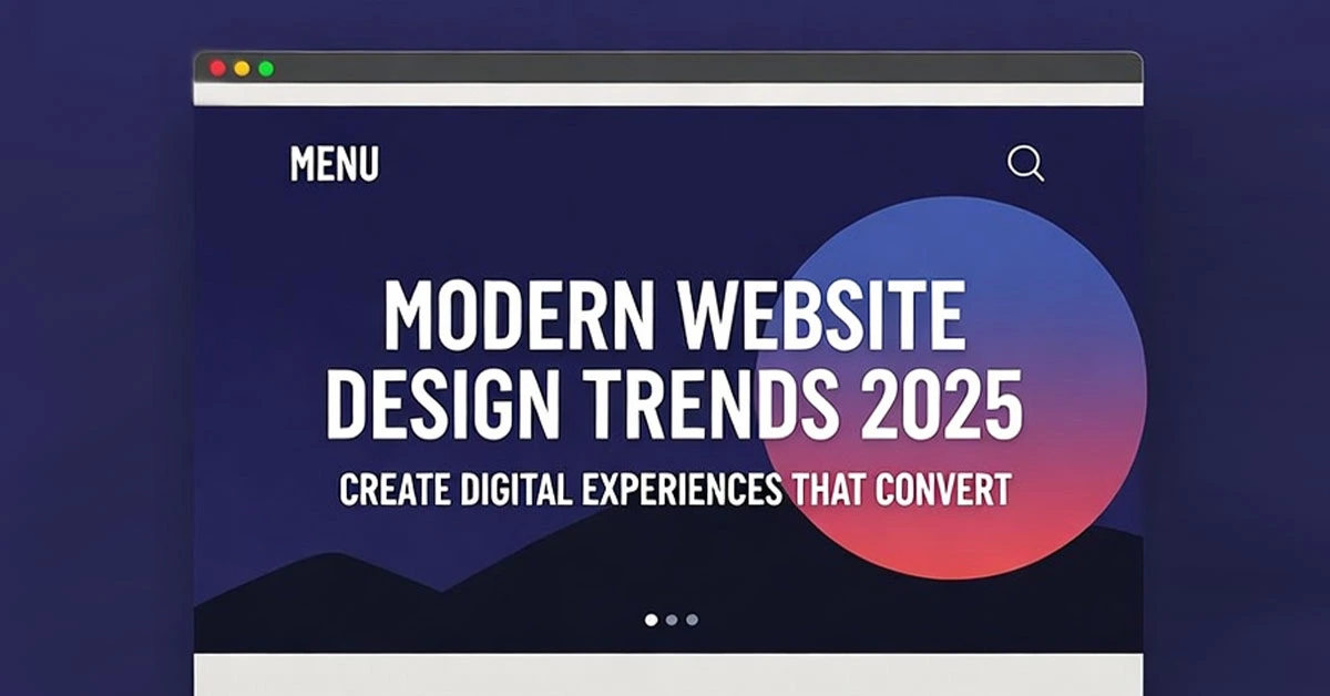
Responsive Web Design Mastery: Create Flawless Experiences on Any Device
In today's multi-device world, responsive web design has evolved from a nice-to-have feature to an absolute necessity. This comprehensive guide covers advanced responsive design techniques that ensure your websites provide optimal experiences across the vast landscape of devices, screen sizes, and contexts.
Beyond Breakpoints: Modern Responsive Design Philosophy
Responsive design has moved beyond simple media queries to embrace a more fluid, component-based approach that adapts to any context.
Content-First Responsive Strategy
Intrinsic Web Design: Letting content determine layout rather than rigid breakpoints
Component-Based Responsiveness: Designing modular components that work in any context
Content Choreography: Strategic content rearrangement across screen sizes
Context-Aware Design: Considering device capabilities and user context
Advanced CSS Layout Techniques
CSS Grid for Complex Layouts
Mastering CSS Grid for sophisticated responsive layouts:
Auto-fit vs Auto-fill: Creating flexible grids that adapt to available space
Grid Template Areas: Semantic layout definition that works across breakpoints
Subgrid Implementation: Nested grid alignment for complex components
Intrinsic Sizing: Using min-content, max-content, and fit-content()
Flexbox for Component Layout
Advanced Flexbox techniques for responsive components:
Flexbox Wrapping Strategies: Creating fluid component layouts
Alignment and Distribution: Precise control over element positioning
Flexibility Calculations: Understanding how flex-grow, flex-shrink, and flex-basis work together
Nested Flexbox Layouts: Building complex components with simple flex containers
Modern Responsive Units and Values
Viewport Units and Beyond
Using modern CSS units for truly responsive designs:
Dynamic Viewport Units: dvh, lvh, svh for mobile browser compatibility
Container Queries: Component-level responsiveness independent of viewport
CSS Math Functions: calc(), min(), max(), and clamp() for fluid calculations
Relative Units Strategy: When to use em, rem, ch, and percentage units
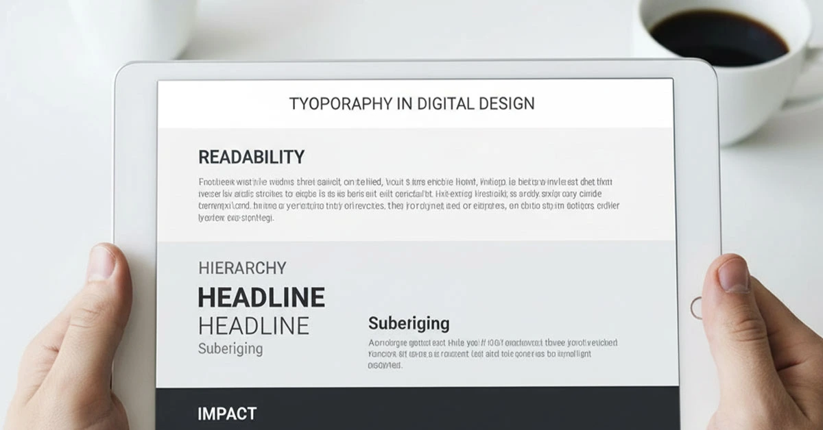
Fluid Typography and Spacing
Creating typography and spacing that scales seamlessly:
CSS clamp() for Fluid Type: Creating type that scales between minimum and maximum sizes
Modular Scale Implementation: Maintaining harmonious proportions across scales
Fluid Spacing Systems: Creating consistent vertical and horizontal rhythm
Viewport-Based Scaling: Strategic use of vw and vh units for scaling elements
Advanced Media Query Strategies
Modern Breakpoint Approaches
Moving beyond device-based breakpoints to content-based approaches:
Content-Based Breakpoints: Breaking where content breaks, not at arbitrary widths
Multi-Axis Media Queries: Considering height, orientation, and aspect ratio
Feature Queries: Using @supports for progressive enhancement
Container Queries: The future of component-level responsiveness
Performance-Focused Responsive Images
Advanced techniques for delivering optimal images across devices:
Srcset and Sizes Attributes: Precise control over image selection
Picture Element Art Direction: Different crops and compositions for different contexts
Next-Gen Image Formats: WebP, AVIF, and JPEG XL implementation
Lazy Loading Strategies: Performance optimization for image-heavy sites
Mobile-First and Progressive Enhancement
Mobile-First Implementation
Strategic approach to building from mobile upward:
Content Priority Strategy: Identifying and prioritizing core content
Progressive Enhancement Layers: Building up from basic functionality
Touch-First Design: Designing for touch interfaces as the primary interaction method
Performance Budgeting: Setting and maintaining performance goals
Testing and Optimization Strategies
Cross-Device Testing Methodology
Comprehensive testing approaches for responsive designs:
Device Lab Strategy: Testing on real devices across the spectrum
BrowserStack and Cross-Browser Testing: Cloud-based testing solutions
Performance Monitoring: Tracking performance across different devices and networks
User Testing: Observing real users across different device contexts
By mastering these advanced responsive web design techniques, you'll be equipped to create websites that provide exceptional experiences regardless of device, screen size, or context, ensuring your designs are future-proof and accessible to all users.
Posted in Web Design