 Salah wardi
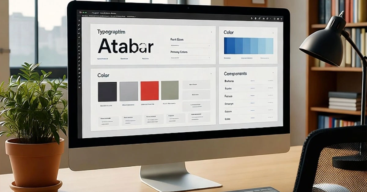
Creating Effective Design Systems for Scalable, Consistent Digital Products
Design systems have become essential tools for organizations building digital products at scale. This comprehensive guide covers everything from initial planning to long-term maintenance of design systems that drive efficiency, consistency, and quality across your entire product ecosystem.
Understanding Design Systems: Beyond Component Libraries
A design system is more than just a collection of reusable components—it's a living ecosystem of standards, principles, and tools that guide how products are designed and built.
Core Components of a Design System
Design Principles: Foundational beliefs that guide decision-making
Design Tokens: Named entities that store visual design attributes
Component Library: Reusable UI components with documented usage
Pattern Libraries: Solutions to common user problems and interactions
Content Guidelines: Standards for voice, tone, and writing style
Accessibility Standards: Guidelines for inclusive design implementation
Planning and Strategy Phase
Assessing Organizational Needs
Before building a design system, understand your organization's specific requirements:
Current State Analysis: Audit existing products and identify inconsistencies
Stakeholder Alignment: Getting buy-in from design, development, and product teams
Scope Definition: Determining what to include in version 1.0 and future iterations
Success Metrics: Defining how you'll measure the system's impact and value
Building the Business Case
Articulating the value of a design system to stakeholders:
Efficiency Benefits: Reduced design and development time
Consistency Advantages: Improved user experience and brand perception
Quality Improvements: Fewer bugs and higher accessibility standards
Scalability: Ability to grow and adapt as products evolve
Foundational Elements: Design Tokens and Principles
Implementing Design Tokens
Creating a systematic approach to visual design properties:
Token Naming Conventions: Systematic approaches to token organization
Token Hierarchy: Global, alias, and component-specific tokens
Multi-Platform Token Systems: Supporting web, iOS, Android, and other platforms
Tooling and Automation: Tools for managing and distributing design tokens
Establishing Design Principles
Creating guiding principles that inform design decisions:
User-Centered Principles: Focusing on user needs and behaviors
Technical Principles: Guidelines for implementation and performance
Brand Principles: Ensuring alignment with brand values and identity
Accessibility Principles: Building inclusivity into the foundation
Component Library Development
Component Architecture and Structure
Designing components for reusability and flexibility:
Atomic Design Methodology: Atoms, molecules, organisms, templates, and pages
Component API Design: Creating intuitive interfaces for component usage
Composition Patterns: Designing components that work well together
Variants and States: Handling different component versions and interactive states
Documentation and Usage Guidelines
Creating comprehensive documentation that teams will actually use:
Usage Examples: Clear examples of correct and incorrect usage
Accessibility Requirements: Specific implementation requirements for accessibility
Code Examples: Copy-paste ready code for developers
Design Files: Linked design assets in tools like Figma or Sketch
Implementation and Adoption Strategies
Phased Rollout Approach
Strategically introducing the design system to minimize disruption:
Pilot Project Selection: Choosing the right projects for initial implementation
Migration Strategies: Approaches for updating existing products
Training and Education: Ensuring teams understand how to use the system
Support Channels: Providing help and guidance during adoption
Integration with Development Workflows
Making the design system part of everyday development:
Package Management: Distributing the system via npm or other package managers
Version Control Strategies: Managing updates and breaking changes
Automated Testing: Ensuring components work as expected across updates
CI/CD Integration: Automating build and deployment processes
Maintenance and Evolution
Governance Model Establishment
Creating processes for managing and evolving the design system:
Contribution Guidelines: Clear processes for proposing and making changes
Review and Approval Workflows: Ensuring quality and consistency
Release Management: Planning and communicating updates
Deprecation Policies: Managing the lifecycle of system components
Measuring Success and Impact
Tracking the design system's effectiveness and value:
Usage Analytics: Monitoring component adoption and usage patterns
Efficiency Metrics: Measuring time savings in design and development
Quality Indicators: Tracking consistency, accessibility, and performance improvements
User Satisfaction: Gathering feedback from both internal teams and end users
Advanced Topics and Future Trends
AI and Automation in Design Systems
Leveraging artificial intelligence to enhance design systems:
Automated Component Generation: AI-assisted creation of new components
Intelligent Documentation: AI-powered search and recommendation systems
Predictive Analytics: Identifying usage patterns and future needs
Personalization Systems: Adaptive components that respond to user context
Cross-Platform and Multi-Brand Systems
Managing design systems for complex organizational needs:
Multi-Brand Systems: Supporting multiple brands within one system
Platform-Specific Adaptations: Tailoring components for different platforms
Internationalization Support: Designing for global audiences and languages
Scale Management: Strategies for managing large, complex systems
By implementing these design system strategies and best practices, you'll create a robust foundation that enables your organization to build better products faster, while maintaining consistency, quality, and accessibility across your entire digital ecosystem.
Posted in Branding