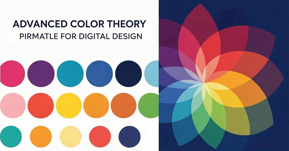
Advanced color theory guide for digital designers with palette examples
Color is one of the most powerful tools in a designer's arsenal, capable of evoking emotions, guiding attention, and communicating brand values instantly. This comprehensive guide delves deep into advanced color theory concepts, providing you with the knowledge and tools to create sophisticated color systems that enhance user experience and drive business results.
The Science of Color Perception
Understanding how humans perceive color is fundamental to effective color application in design. Color perception involves complex interactions between light, the human eye, and the brain.
Biological and Psychological Factors
Color Constancy: How our brain perceives colors consistently under different lighting conditions
Simultaneous Contrast: How surrounding colors affect our perception of a color
Cultural Associations: How different cultures interpret colors differently
Accessibility Considerations: Accounting for color vision deficiencies
Color Systems and Digital Implementation
RGB vs CMYK: Understanding the Differences
Different color models serve different purposes in digital and print design:
RGB (Red, Green, Blue): Additive color model for screen display
CMYK (Cyan, Magenta, Yellow, Black): Subtractive color model for printing
HSL/HSV: Hue, Saturation, Lightness/Value models for intuitive color manipulation
LAB Color: Device-independent color space for accurate color representation
Hexadecimal and Digital Color Representation
Understanding how colors are represented in digital environments:
Hexadecimal color codes and their structure
RGB and RGBA values for web implementation
CSS color functions and modern color spaces
Color management across different devices and screens
Advanced Color Harmony Principles
Traditional Color Schemes Revisited
Moving beyond basic color relationships to sophisticated harmony techniques:
Complementary Schemes: High contrast for attention-grabbing elements
Analogous Schemes: Harmonious, low-contrast combinations
Triadic Schemes: Balanced, vibrant color relationships
Tetradic Schemes: Complex, rich color combinations
Split-Complementary: Balanced contrast with visual interest
Modern Color Relationship Techniques
Contemporary approaches to color harmony:
Color Weight and Balance: Distributing visual weight across compositions
Dynamic Color Relationships: Creating movement and energy through color
Color Temperature Contrast: Using warm and cool colors for depth
Saturation and Value Gradients: Creating sophisticated tonal relationships
Color Psychology in Digital Contexts
Emotional and Psychological Impact
How colors affect user perception and behavior in digital environments:
Red: Energy, urgency, passion, and importance
Blue: Trust, security, calmness, and professionalism
Green: Growth, success, nature, and financial contexts
Yellow: Optimism, attention, caution, and warmth
Purple: Luxury, creativity, wisdom, and spirituality
Orange: Enthusiasm, creativity, and call-to-action elements
Contextual Color Meaning
How color meaning changes based on context and application:
E-commerce vs corporate website color considerations
Mobile app vs desktop application color strategies
Cultural considerations for global audiences
Industry-specific color conventions and expectations
Creating Comprehensive Color Systems
Building Scalable Color Palettes
Developing color systems that work across entire product ecosystems:
Primary Colors: Core brand colors and their applications
Secondary Colors: Supporting colors for variety and hierarchy
Neutral Colors: Grays, blacks, and whites for text and backgrounds
Semantic Colors: Colors for specific states and messages (success, warning, error)
Extended Palettes: Additional colors for data visualization and special cases
Color Tokenization and Design Systems
Implementing color systems in modern design workflows:
Creating color tokens for consistent implementation
Establishing naming conventions and documentation
Implementing dark mode and theme variations
Automating color system maintenance and updates
Accessibility and Inclusive Color Practices
WCAG Color Contrast Guidelines
Ensuring your color choices are accessible to all users:
Understanding contrast ratios and requirements
Tools and techniques for testing color accessibility
Color-blind friendly palette creation
Beyond color: Using patterns, icons, and text labels
Accessible Color Combinations
Creating palettes that work for users with visual impairments:
Safe color combinations for various types of color blindness
Maintaining brand identity while ensuring accessibility
Testing methods and user validation techniques
Legal and ethical considerations for accessible design
Implementation Strategies and Workflows
Color in User Interface Design
Practical application of color in digital interfaces:
Establishing visual hierarchy through color
Color for interactive states and feedback
Background and surface color relationships
Text legibility and readability considerations
Color in Data Visualization
Using color effectively in charts, graphs, and data displays:
Categorical vs sequential color schemes
Color for highlighting and emphasis
Avoiding misleading color representations
Accessible data visualization color practices
Advanced Techniques and Future Trends
Dynamic and Adaptive Color Systems
Modern approaches to color in digital products:
Algorithmic color generation and manipulation
Context-aware color adaptation
Personalized color themes and preferences
Real-time color adjustment based on environment
Emerging Color Technologies
Staying ahead of color trends and technologies:
Wide color gamuts and HDR displays
CSS Color Module Level 4 and new color spaces
Variable fonts and color font technologies
Augmented and virtual reality color considerations
By mastering these advanced color theory concepts and implementation strategies, you'll be equipped to create sophisticated, effective color systems that enhance user experience, communicate brand values, and drive engagement across all your digital design projects.
Posted in Branding